
Updated
What is a graph interpretation question?
Graphs are a standard way of presenting data to allow for easier and quicker understanding.
Graphs (or charts) can be used in addition or instead of text and may take one of several forms – for example, line graphs, bar charts, pie charts or tables. Large and complex data can be presented for comparison or analysis, often by rounding data to the nearest appropriate figure.
Graph interpretation questions involve both numerical/mathematical skills as well as reasoning skills; therefore they are popular questions in numerical reasoning tests.
Each graph interpretation question involves the consideration of a graph or chart, reading a short written question and then using the data to select the appropriate answer, usually from a choice of four answers.
Where might you face graph interpretation questions?
You are likely to encounter a graph interpretation question as part of a numerical reasoning test when applying for jobs that require mathematical / numerical skills, as well as an ability to interpret data.
Obviously any role within a bank, financial institution or consulting firm will want to specifically test numerical skills, but you are likely to face these types of numerical reasoning questions in almost every corporate role, particularly at graduate level.
Tips on how to answer graph interpretation questions
The key to answering graph interpretation questions is to extrapolate the data quickly and cut through the irrelevant information. You can then reach an approximate answer which can be matched to the relevant answer from the multiple-choice list.
Read the question thoroughly to ascertain precisely what you are looking for and then consult the data in the graph, using mental arithmetic to give a rough calculation. This may be enough to eliminate the three wrong answers. If it isn’t, do a more thorough calculation.
Example graph interpretation practice question 1
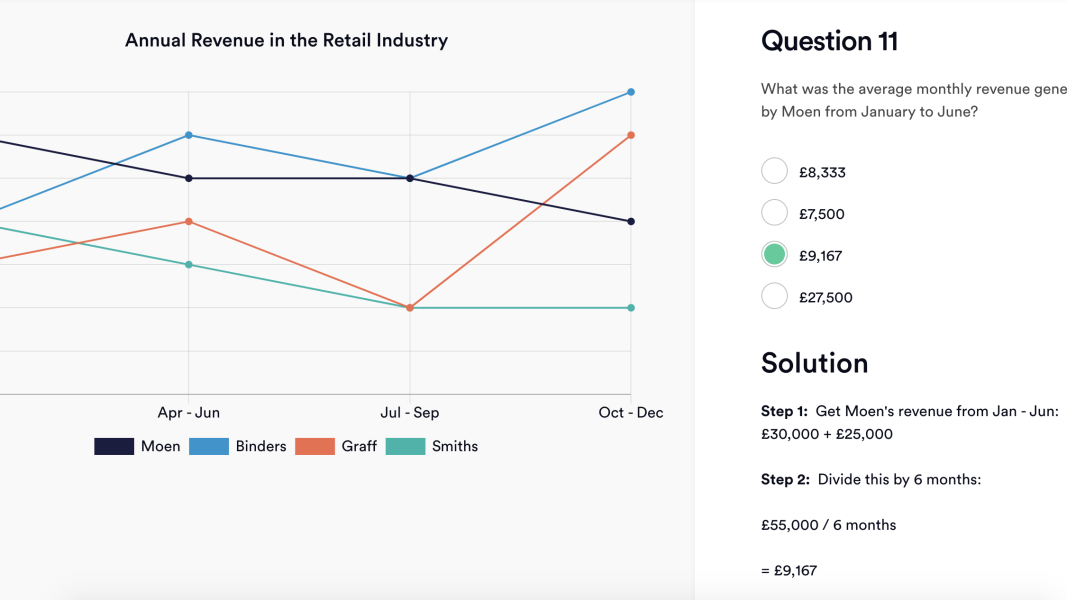
In this question you will see that you need to find the average monthly revenue generated from January to June by Moen. The key at the bottom shows that Moen is indicated by the black line, which means you can discard the other lines.
You can immediately see that the graph covers the period from Jan–Dec. Therefore you only need to look at the left-hand side of the table, at the two data points for ‘Jan–Mar’ and ‘Apr–Jun’.
Revenue is indicated by rounded thousands down the left axis, in increments of £5k. Take the £30k from ‘Jan–Mar’ and add this to the £25k from ‘Apr–Jun’, which will give you a figure of £55,000.
To determine the average monthly revenue you will then need to divide £55k by 6, as January to June is a 6-month period.
You could estimate that 55 is almost 60, and 60 divided by 6 is 10, so you are looking for a figure of just under 10. You could also do a more precise calculation and divide 55/6 to get 9.167.
Either way, the answer is £9,167.
Example graph interpretation practice question 2
This question is slightly more complicated, as you have to use the data to then carry out the relevant calculations.
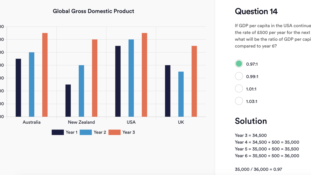
You can see that the question relates only to GDP for the USA, so you only need to look at the columns relating to the USA.
The chart gives you the information up to year 3, but the question is asking about the ratio of year 6 compared to year 4. This means you will need to calculate the projected GDP of years 4 and 6.
Do this by taking the figure from year 3 (£34,500) then adding the £500 per year projected growth. This will give you:
Y3 - £34,500
Y4 - £35,000 (Y3 £34,500 + 500)
Y5 - £35,500 (Y4 £35,000 + 500)
Y6 - £36,000 (Y5 £35,500 + 500)
You will then need to calculate the ratio (the comparison of the two values), expressed as Y4:Y6.
Divide Y4 by Y6 (e.g. 35,000/36,000) which gives you 0.97 – which is answer A.
How to prepare for graph interpretation questions
It’s easy to get overwhelmed when faced with graphs, so it’s a good idea to familiarise yourself with as many types and practice questions as you can find.
Start with taking our practice tests. Use these tests to find out which parts of the calculation are your weakest point, so you can target your practice.
Make sure to develop a methodical approach to each question. Start by looking at the data/chart/graph and taking a quick scan of all the information. Note what each axis shows and how many sets of information are represented by the one chart.
Then you can look at the question to see which are the relevant parts of the information that you require to make an approximate calculation of the answer.
Don’t get caught up in the full detail of the chart or graph, which will usually contain much more information than is required to solve the question. After considering all the parts of the data, use the question to hone in on the relevant information and ignore the rest.
Remember that you do not always need to do precise calculations; often a rough estimate will be enough to find the correct answer. However, it can be helpful to familiarise yourself with various forms of basic arithmetic such as percentages, ratios and fractions, to ensure that you are comfortable carrying out basic calculations.
To improve your test results, read our complete guide to Numerical Reasoning.